
You’ve got a Class-A office building in Irvine, a professional suite in Costa Mesa, or a corporate campus in Corona. The marble floors are polished. The receptionist is friendly. But there’s one thing that can quietly undermine all that prestige before a visitor even says hello: weak lobby signage.
We see it all the time. A beautiful space with a flimsy, vinyl sticker on the wall. Or worse, nothing at all.
Your lobby sign isn’t just a name on a wall. It’s a handshake. It’s the first piece of evidence that you run a tight ship. With our years of experience crafting lobby signage for office buildings in Southern California, we’ve learned exactly what works and what looks like an afterthought.
Let’s walk through the lobby signage strategies that actually hold up in premium spaces like Santa Ana and Riverside.
Here’s a quick visual overview of the key lobby signage strategies Class-A office buildings can use to create a more polished, professional, and cohesive visitor experience.

1. Establish a Premium First Impression Through Branding
Walk into any lobby in Anaheim. What catches your eye first? If the answer is “the empty wall,” that’s a missed opportunity.
Your reception area is prime real estate. That wall behind the front desk should immediately tell visitors: You are in the right place. This is a professional operation.
For Class-A buildings, subtlety wins. You don’t need flashing lights or loud colors. You need clean lines, quality materials, and a sign that feels permanent—because it is. If your lobby sign doesn’t look like it cost more than the reception desk, keep designing.
2. Use Dimensional Lettering for Depth and Sophistication
Flat graphics belong on brochures, not on your lobby wall. If you print a logo on vinyl and stick it to drywall, you look like a pop-up shop.
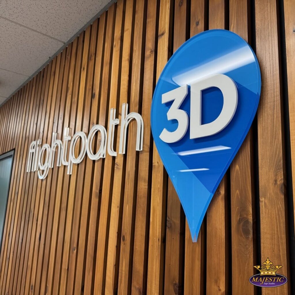
Dimensional letters change the game. These are raised, individual letters made from metal or acrylic. They cast shadows. They catch light. They feel architectural.
Three things to get right with dimensional letters:
- Material thickness – Minimum ¾ inch for presence. Thinner looks cheap.
- Mounting method – Flush mount sits tight to the wall. Standoffs create a shadow line. Choose based on your wall finish.
- Color contrast – Your letters need to be separate from the background. Silver on light gray? Invisible. Dark bronze on light stone? Perfect.
When we install corporate lobby signs with dimensional lettering, the wall suddenly has texture. Your logo has gravity.
3. Incorporate Backlit Elements for Modern Appeal
Here’s a reality check for office spaces in Riverside and Costa Mesa: your lobby lighting might be terrible after 5 PM. Recessed ceiling lights create shadows. Without dedicated illumination, even a gorgeous sign disappears.
LED backlit signs solve that completely.
Before you approve a backlit sign, check:
- Power source within 15 feet of your mounting location
- The wall can support the weight (LED is light, but not weightless)
- No direct glare into the receptionist’s eyes
- Dimmer option if the lobby is used after hours
- Backup driver (cheap LEDs fail; commercial grade lasts)
A halo-lit logo (where the light glows around the letters) looks sophisticated. It doesn’t scream. It suggests.
4. Align Signage With Interior Architectural Design
We’ve walked into lobbies in Orange County where the sign is gorgeous, but it’s mounted on a textured stone wall with the wrong hardware. It leans. It looks temporary.
Your signage needs to feel integrated. If your building uses brushed brass elevators, don’t use chrome letters. If you have a living moss wall, don’t use high-gloss black acrylic.
Do this, not that:
| Do This | Not That |
| Brushed aluminum on glass wall | Polished chrome on mirrored surface |
| Matte acrylic on painted drywall | Glossy laminate on textured stone |
| Dark bronze on light wood | Bright silver on white marble |
| Frosted acrylic on backlit panel | Clear acrylic with visible mounting hardware |
Acrylic lobby signs are versatile because they can match almost any finish—matte, gloss, frosted, or metallic. But we always ask: what else is in this room?
5. Prioritize Tenant Visibility Without Clutter
Here’s a tension point in multi-tenant buildings. The landlord wants their branding front and center. Each tenant wants their name visible. And suddenly, your lobby looks like a high school hallway with too many posters.
The fix? Hierarchy.
Do vs. Don’t – Tenant Directory Rules
| Do | Don’t |
| Group tenants alphabetically or by floor | List tenants in random order |
| Use the same font size for all tenant names | Let one tenant pay for larger letters |
| Update the directory quarterly | Leave old tenants on the wall for years |
| Use a clean, sans-serif font | Mix three different typefaces |
| Keep landlord branding separate (upper wall) | Put tenant names inside the main logo |
Your primary reception signage (building name or landlord logo) gets the premium spot. Tenant names go on a clean, organized directory. No overlapping. No competing fonts.
6. Optimize Wayfinding From Entry to Elevator
Here’s a test you can run tomorrow morning. Park at your office. Walk in the main entrance. How long does it take you to find the elevator or the reception desk?
If you hesitated even for three seconds, your wayfinding failed.
Run this walkthrough test yourself:
- Stand at the public entrance. Don’t move your feet.
- Can you see any directional sign within 3 seconds? Yes or no.
- Walk toward the reception desk. Count your steps.
- From the reception desk, can you see the elevator bank sign?
- Look behind you. Is there a sign pointing back to the exit?
- If you hesitated or turned your head more than 45 degrees at any spot, that location needs a sign.
Your lobby sign should anchor the room. But you also need directional cues—wall plaques, hanging blades, or floor decals that guide people naturally from the door to the front desk to the elevator core.
7. Maintain Consistent Typography and Brand Standards
We’ve seen a $10 million building use three different fonts across three different signs inside the same lobby. It looks sloppy. And your tenants notice.
Pick one font family. Stick to it.
Grab your phone and photograph every sign in your lobby. Check for:
- Three or fewer font families total (ideally one family with weights)
- Same logo placement on every tenant sign
- No stretched or squished typefaces (maintain original proportions)
- Identical spacing between letters across all signs
- Same color codes (no “close enough” grays)
- Consistent mounting height for all wall signs
Consistency feels expensive. Chaos feels cheap. When we design lobby signs for Orange Countybuildings, we always ask for your brand guide first. If you don’t have one, we’ll help you lock down the basics.
8. Leverage Lighting to Highlight Key Signage Areas
You don’t need a Broadway marquee. But you do need directed light.
Track lighting or picture lights aimed at your dimensional letters make the sign pop during evening hours. If you have LED backlit signs, you’re already covered. But for non-illuminated signs, add a dedicated light source.
Match your light to your sign material:
| Lighting Type | Best For | Avoid Using On |
| Picture light (track or wall-mounted) | Brushed metal, stone, wood | High-gloss acrylic (glare) |
| LED backlight (halo effect) | Acrylic, glass, dimensional letters | Solid metal (light won’t pass through) |
| Front downlight (recessed ceiling) | Painted dimensional letters | Dark materials (absorbs light) |
| Grazer light (wall wash from floor) | Large format logos, textured walls | Small lettering (creates shadows) |
| No dedicated light | Skylit lobbies or floor-to-ceiling windows | Any lobby without natural light |
A dark lobby with a dark sign is just a wall. A dark lobby with a lit sign is a landmark.
Real World Lobby Signage Project Spotlight in Irvine, California
For a new office in Irvine, Home Offer Direct needed a dimensional lobby logo mounted on a shiplap-style feature wall, balancing a polished, Class-A look with budget realities. During the project, material costs, color mismatches, and limited client availability created challenges, but we kept things on track through clear communication, coordination with a secondary contact, and precise paint matching to ensure brand consistency.
The final result was a fully in-house fabricated dimensional sign, installed in sync with the client’s wall build-out, delivering a clean, professional focal point that enhances the overall lobby experience. This project reflects what matters most in premium office signage: flexibility, accuracy, and execution that aligns with real-world constraints.
Trusted Partner for Your Lobby Signage Needs
You need a full-service signage company. One that handles dimensional letters, acrylic fabrication, LED backlighting, and mounting on premium walls without damage.
Majestic Sign Studio delivers:
- Full-service, no subcontractors: We measure, design, fabricate, and install. Everything under one roof.
- Years of lobby signage experience: Senior fabricators like Alex Martinez have been installing corporate lobby signs since before most local shops opened.
- Permitting included: We navigate sign codes for Class-A buildings in Corona, Irvine, Anaheim, Riverside, Santa Ana, and Costa Mesa as part of every project.
- Custom-fabricated, not stock: No templates. No “close enough.” Your LED backlit signs and dimensional letters are built from scratch to match your brand’s typography, colors, and wall dimensions.
- Family-owned since 2012: We build lobby signage that lasts through daily cleaning and reinforces your brand for years.
Ready to Upgrade Your Lobby Signage?
You don’t need a full building renovation. You need one wall, one sign, and one partner who knows how to execute.
A blank wall is a missed opportunity every single day. A professional lobby sign tells visitors, tenants, and employees that you care about the details.
Contact Majestic Sign Studio today. Let’s talk about your lobby. We’ll bring the tape measure. You bring the vision.