
Creating Your Logo Design

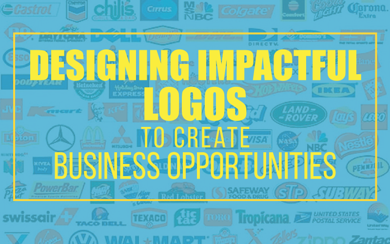
Designing Impactful Logos To Create Business Opportunities

Table of Contents

If created properly, a company logo is much more than a splash of color on your letter head. It’s a recognizable symbol of what your organization represents. The best logo for your business will feature a design that can both inspire and intrigue your potential customers. Just look at the trademarked logos of Pinterest, Facebook, Twitter and Target–they don’t even say the business’s name, but that doesn’t stop the majority of people from knowing exactly what brand they represent. By creating an effective logo, you will be able to build a positive image for your brand and pave the way for success for your business or organization.

To design an impactful logo and create business opportunities, adhere to these tips:

1. Stick To Your Brand

The first impression and interpretation of a logo can develop in an instant. A business should aim to shape this message with their logo design. When brainstorming, start with your company’s mission statement. Have a clear understanding of your organization’s purpose, including your company’s vision and values. Each element of your design should work towards conveying this message to your potential customers and partners.

2. Be Strategic With Your Design Elements

While keeping your company’s vision in mind, also be sure to choose your design elements carefully.

Fonts

Typography is a crucial element of your logo. When it comes to choosing a font, readability it key. Avoid using more than two typefaces in your logo, and ensure your font enhances your design and provides impact for the message, look and feel you want to convey.

Colors

Colors also play a vital role in readability. Ensure the color combinations you choose contribute to a clear, decipherable message. Try and stick to a max of three colors for your logo—any more will be difficult (and expensive) to reproduce in the long run. But don’t let that stop you from experimenting—it’s recommended to create multiple proofs of your logo with various color schemes to test which will be the most effective for your target audience. You may end up choosing a few different versions to ensure it can be reproduced on both light and dark backgrounds.

Images

Only use images that make sense. If you can think of a clever image that conveys who you are and what you do, go ahead and use it. If your image distracts from the readability of your design, avoid it.

The fonts, colors and images you use must work together in harmony to create balance. Remember, the majority of us are visual by nature, and your logo is what’s going to capture the attention of the public. Creating an appealing visual representation of all that your business can do is imperative to the success of your company, and the future of your brand.

 3. Keep it Clear & Clean

Whether you use a font-based logo, a symbol, or combination of both, your design must be clear, concise, and easy to reproduce. It’s important to have a coherent, readable design, not only so you can create brand recognition, but so you can create the right type of brand recognition. Some logos leave a very distinct, sometimes confusing, first impression due overlooked design elements. Avoid bad logo design to prevent potential damage to your brand and consistently represent it in a positive light.

Are you a new organization or business that needs a logo designed, or are you looking for a fresh look? Our team of experts are ready to create your vision.

Picture of Gordy Wolfe

Gordy Wolfe

President & Owner of Majestic Sign Studio, is a visionary leader based in Corona, California, driving innovation in the signage industry. With a deep passion for transforming brand ideas into tangible, high-impact visual solutions, Gordy has steered Majestic Sign Studio to a reputation for excellence—offering custom indoor and outdoor signs, ADA signage, wall murals, vehicle wraps, and more.

Leading the company since 2012, Gordy brings over 30 years of industry experience—including nearly 21 years as a National Account Manager at AkzoNobel (Glidden Professional) — AkzoNobel is a Fortune 500 global company. His leadership blends deep expertise, creative vision, and hands-on involvement to deliver innovative, high-quality signage solutions. Under his guidance, Majestic Sign Studio combines creative design, precise fabrication, and expert installation to help businesses across the United States achieve standout branding. Every project reflects both aesthetic appeal and strategic purpose—making signage not just seen, but remembered.

Tell Us About Your Sign Project
What type of signage are you looking for?
Allowed file size up to 50MB: jpg, pdf, eps, ai, png

Recent Posts

Commercial Sign Company Guide | Majestic Sign Studio

What Makes a Great Commercial Sign Company in Southern California?

A great commercial sign company does more than produce signs—it manages the entire process from design and permitting to fabrication and installation. Choosing the right partner ensures your signage is code-compliant, visually impactful, and built to last. This guide explains what to look for when selecting a commercial signage company for your business or property.

Read More
Tell Us About Your Sign Project
What type of signage are you looking for?
Allowed file size up to 50MB: jpg, pdf, eps, ai, png

Recent Posts

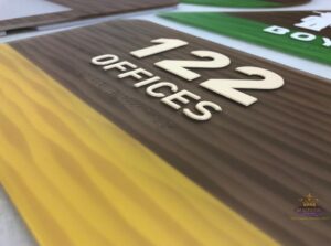
Room 122 offices sign with raised numbers, tactile lettering, and braille

ADA Signage Requirements for Commercial Buildings in California

For ADA signage in commercial buildings in California, one must comply with both the Americans with Disabilities Act (ADA) and the California Building Codes (CBC). For facility managers and business owners, the specific requirements for tactile signs, braille, and placement are not optional. Non-compliance leads to failed inspections, accessibility lawsuits, and costly retrofits. The rules apply to any permanent room or space: restrooms, stairwells, exits, conference rooms, and accessible parking.

Read More
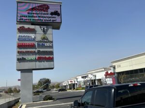
Multi-tenant pylon sign with tenant panels and digital message display at a Southern California retail property

Essential Sign Types Every Multi-Tenant Building Needs in Southern California

Managing a multi-tenant building in Southern California comes with a daily reality: people get lost. Delivery drivers circle parking lots. Clients walk into the wrong suites. Tenants get frustrated calls from visitors who can’t find the elevator bank.

That confusion isn’t just annoying; it costs you time, tenant satisfaction, and ultimately, lease renewals.

Your multi-tenant building signage in Southern California is either solving those problems or making them worse. When signage is unclear, outdated, or incomplete, you pay for it with disrupted operations and tenant turnover.

Read More
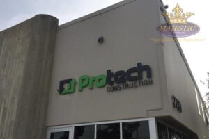
ProTech Construction dimensional building sign installed on a commercial property by Majestic Sign Studio

Complete Signage Planning Guide for Commercial Property Managers in Southern California

Commercial property signage Southern California projects usually start with a simple challenge: your property may be active, but it doesn’t always feel easy to navigate or visually consistent. Tenants might be visible, but visitors still hesitate at entry points or miss key locations.

Across Irvine office districts, Anaheim retail corridors, Riverside business parks, Santa Ana commercial streets, Costa Mesa centers, and Corona developments, signage often becomes part of how smoothly your property actually operates day to day.

In most multi-tenant properties we evaluate, confusion typically happens within the first 30–60 seconds of arrival—usually at entry points, parking transitions, or tenant identification zones. This is where structured signage planning makes the biggest operational difference.

Read More