
The Psychology of Color in Business

Table of Contents

Color is a tricky thing, especially when it comes to their use in business.

Logo Design

When designing a logo, it is important to take into consideration:
a) What industry are you in? Industrial companies tend to stay away from lighter colors.
b) Who you are trying to reach? For instance pink probably wouldn’t have gone over too well with the Harley Davidson market.
c) What response are you trying to invoke? A day spa is best served using lighter (or secondary) colors to convey tranquility.

Although people may not cognitively process how a certain color makes them feel or how they react to it, our brains are hard at work processing information. Our responses to colors are processed through filters of past experiences, cultural backgrounds, and personal preferences. However, when it comes to businesses branding, there are some norms that many companies have found to be successful.

Colors for Business

Take a look at these color meanings in businesses:

Red
Youthful. Bold.

Red is an attention-grabber. Red tends to energize. It is an exciting and motivating color.

Just as true as it was in the bull-fighting days, red still invokes passion. Red is used as in call-to-action buttons pretty often because it stands out and can be used to trigger an impulse to click.

Yellow
Clarity. Warmth.

Yellow is an uplifting color. It also stimulates the left side of the brain which is the logical side.

In business, yellow is a good fit for companies in the entertainment industry or geared toward children. Displays often use yellow to capture a shopper’s attention.

Blue
Dependable. Strength.

Blue invokes feelings of reliability and confidence. Blue is calming and relaxing. Think of the sky and the ocean.

Since blue is more of a conservative color, it is often used in finance industries, insurance, and tech. Blue invokes feelings of trust and harmony.

Orange
Cheerful. Confidence.

Orange is an exciting, vibrant color. It conveys feelings of adventure, enthusiasm, and is found to be inspiring.
Given the energizing undertones, travel agencies, food industries, those appealing to the youth market often use orange.

Green
Growth. Health.

A symbol of vitality, green invokes feelings of calm. Like blue, it is often associated with nature and the environment. Green is also associated with money in the US. See, there’s one of those cultural filters.

It should come as no surprise that green is often used in the health industries, food, fitness, and natural products. Darker greens are used in the finance segment frequently, capitalizing on the money and wealth associations of colors.

Purple
Imaginative. Wise.

We saved the best for last, not that we are biased at all (wink, wink). Purple is often associated with regal. It conveys feelings of creativity and extravagance. Young adults often relate purple as a symbol of sophistication.

In business, purple is often used to highlight quality. Educational institutions often use purple to encourage creativity and thought. Traditionally, purple has been used to target products geared toward women and kids.

Now that you understand a little more about the psychology of colors, take a look at the color chart. Do you have a deeper understanding of why various companies used specific colors in their logo? Do you relate the company with the corresponding psychology behind the color?

Majestic Sign Studios are professionals in graphic design. When it comes to branding, consult with one of our experts to ensure your messaging is communicating what you want it to. Give us a call at 951-735-5001 or tell us about your project.

Picture of Gordy Wolfe

Gordy Wolfe

President & Owner of Majestic Sign Studio, is a visionary leader based in Corona, California, driving innovation in the signage industry. With a deep passion for transforming brand ideas into tangible, high-impact visual solutions, Gordy has steered Majestic Sign Studio to a reputation for excellence—offering custom indoor and outdoor signs, ADA signage, wall murals, vehicle wraps, and more.

Leading the company since 2012, Gordy brings over 30 years of industry experience—including nearly 21 years as a National Account Manager at AkzoNobel (Glidden Professional) — AkzoNobel is a Fortune 500 global company. His leadership blends deep expertise, creative vision, and hands-on involvement to deliver innovative, high-quality signage solutions. Under his guidance, Majestic Sign Studio combines creative design, precise fabrication, and expert installation to help businesses across the United States achieve standout branding. Every project reflects both aesthetic appeal and strategic purpose—making signage not just seen, but remembered.

Tell Us About Your Sign Project
What type of signage are you looking for?
Allowed file size up to 50MB: jpg, pdf, eps, ai, png

Recent Posts

Commercial Sign Company Guide | Majestic Sign Studio

What Makes a Great Commercial Sign Company in Southern California?

A great commercial sign company does more than produce signs—it manages the entire process from design and permitting to fabrication and installation. Choosing the right partner ensures your signage is code-compliant, visually impactful, and built to last. This guide explains what to look for when selecting a commercial signage company for your business or property.

Read More
Tell Us About Your Sign Project
What type of signage are you looking for?
Allowed file size up to 50MB: jpg, pdf, eps, ai, png

Recent Posts

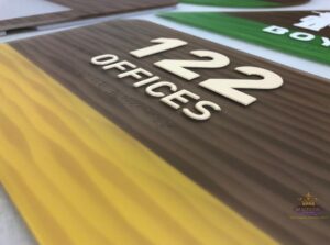
Room 122 offices sign with raised numbers, tactile lettering, and braille

ADA Signage Requirements for Commercial Buildings in California

For ADA signage in commercial buildings in California, one must comply with both the Americans with Disabilities Act (ADA) and the California Building Codes (CBC). For facility managers and business owners, the specific requirements for tactile signs, braille, and placement are not optional. Non-compliance leads to failed inspections, accessibility lawsuits, and costly retrofits. The rules apply to any permanent room or space: restrooms, stairwells, exits, conference rooms, and accessible parking.

Read More
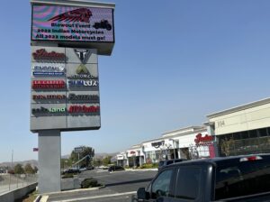
Multi-tenant pylon sign with tenant panels and digital message display at a Southern California retail property

Essential Sign Types Every Multi-Tenant Building Needs in Southern California

Managing a multi-tenant building in Southern California comes with a daily reality: people get lost. Delivery drivers circle parking lots. Clients walk into the wrong suites. Tenants get frustrated calls from visitors who can’t find the elevator bank.

That confusion isn’t just annoying; it costs you time, tenant satisfaction, and ultimately, lease renewals.

Your multi-tenant building signage in Southern California is either solving those problems or making them worse. When signage is unclear, outdated, or incomplete, you pay for it with disrupted operations and tenant turnover.

Read More
ProTech Construction dimensional building sign installed on a commercial property by Majestic Sign Studio

Complete Signage Planning Guide for Commercial Property Managers in Southern California

Commercial property signage Southern California projects usually start with a simple challenge: your property may be active, but it doesn’t always feel easy to navigate or visually consistent. Tenants might be visible, but visitors still hesitate at entry points or miss key locations.

Across Irvine office districts, Anaheim retail corridors, Riverside business parks, Santa Ana commercial streets, Costa Mesa centers, and Corona developments, signage often becomes part of how smoothly your property actually operates day to day.

In most multi-tenant properties we evaluate, confusion typically happens within the first 30–60 seconds of arrival—usually at entry points, parking transitions, or tenant identification zones. This is where structured signage planning makes the biggest operational difference.

Read More