What are the top signage trends Southern California businesses need to understand in 2026? If you’re planning a sign upgrade or new installation this year, that question is likely shaping your decisions.
A sign trend is just an idea. What determines whether it helps your business or hurts it is execution: materials, fabrication quality, installation precision, and how consistently your brand carries across applications. When businesses search for signage trends in 2026, what they’re really looking for is what performs well here, under Southern California conditions.
In a region where companies compete for attention across Los Angeles, Orange County, San Diego, and the Inland Empire, that distinction matters every day. A dimensional letter sign made from low-grade acrylic conveys something very different from one fabricated from brushed aluminum and mounted with precision. Same trend. Completely different impression.
The trends shaping 2026 reflect what serious businesses are investing in: cleaner design, smarter materials, and cohesive branding inside and out. But trends only create value when they’re executed properly. Below are the ten developments worth watching, and how to evaluate them correctly.
Why Signage Trends Matter for Southern California Businesses
What makes signage trends different in Southern California? Three factors: competition, climate, and customer expectations.
Competition density means your sign competes with dozens of others in a single line of sight. Drive any commercial corridor from Santa Monica to San Diego, and you’ll see it immediately. Visibility windows are measured in seconds.
Climate adds pressure. UV exposure fades color. Heat stresses adhesives. Coastal air accelerates corrosion. Materials that might last years elsewhere can fail quickly here if poorly specified.
Customer expectations complete the equation. Southern California consumers are surrounded by refined branding, from boutique hotels to tech campuses. They may not analyze signage consciously, but they register when it looks dated or cheaply fabricated.
Staying current with commercial signage trends isn’t about novelty. It’s about maintaining relevance in a market that doesn’t forgive stagnation.
Top 10 Signage Trends for Southern California in 2026
1. Minimalist & Brand-Focused Sign Design
Clean typography. Controlled color palettes. Design that allows the logo to lead.
Minimalism removes distractions and reinforces brand identity. For businesses evaluating business signage trends in Southern California, this approach consistently delivers longevity. But minimal must look intentional, not unfinished.
What quality looks like:
Even letter spacing. Exact brand color matching. Fabricated dimensional letters with consistent stroke widths. Perfectly level mounting.
What poor execution looks like:
Uneven spacing. Slight color shifts. Letters drifting off baseline. Minimal design that reads as incomplete rather than refined.
2. LED & Energy-Efficient Illuminated Signs
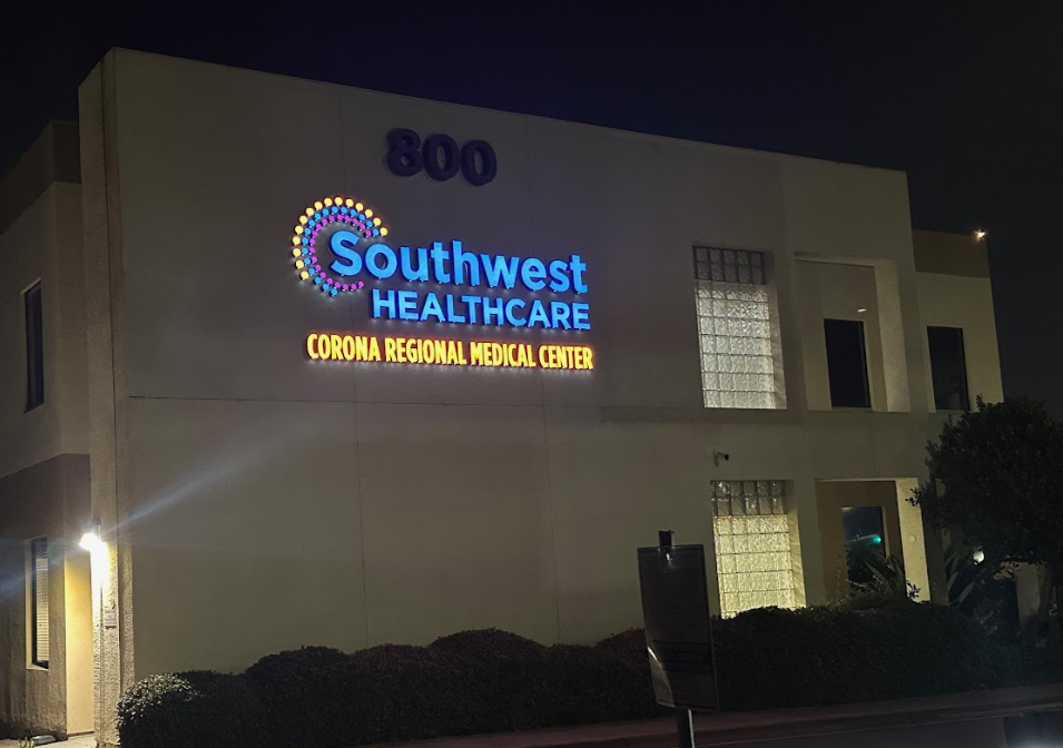
Illumination is standard. Efficiency and precision are the differentiators.
LED channel letters and backlit signs reduce energy consumption while improving nighttime visibility. In California’s regulatory and cost environment, that matters. But illumination quality varies significantly.
What quality looks like:
Even light distribution. No hot spots. Consistent color temperature. Weather-sealed wiring. Clean fabrication with concealed hardware.
What poor execution looks like:
Visible LED dots. Patchy brightness. Inconsistent light color across letters. Premature failure from poor sealing.
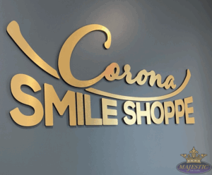
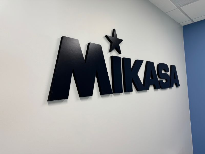
3. Dimensional Letters & 3D Signage
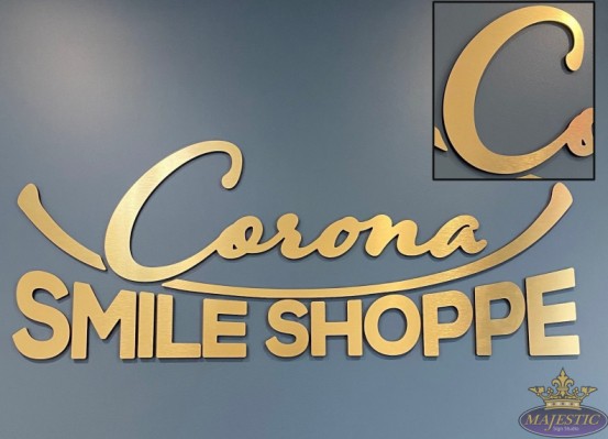
Depth adds authority. In professional and retail environments alike, dimensional letters instantly elevate perception.
For companies exploring custom signage trends for 2026, 3D signage remains one of the strongest investments. But fabrication precision determines whether it feels premium or improvised.
What quality looks like:
Smooth returns. Consistent depth. Hidden mounting hardware. Finishes are resistant to warping and fading. Clean edges.
What poor execution looks like:
Visible brackets. Uneven depth. Rough cut edges. Materials that expand, contract, or discolor within a short time.
4. Sustainable & Eco-Friendly Sign Materials
Sustainability is no longer a niche request in California; it’s expected.
Recycled aluminum, responsibly sourced substrates, and eco-conscious vinyl options are increasingly viable without sacrificing durability. The key is selecting materials that balance environmental goals with long-term performance.
What quality looks like:
Sustainable materials with structural integrity. UV-stable finishes. Verified sourcing. Performance equal to traditional substrates.
What poor execution looks like:
Compromised durability. Limited finish options are forcing brand changes. Faster fading under sun exposure.
5. High-Impact Storefront Signs for Foot Traffic

Retail visibility is immediate or non-existent.
Storefront signage must withstand direct sunlight, heavy pedestrian traffic, and fast-moving traffic. For businesses reviewing business sign trends in California, storefront presence often delivers the most measurable impact.
What quality looks like:
Appropriate letter sizing for distance. Strong contrast. Proper illumination balance. Materials rated for sustained UV exposure. Placement optimized for sightlines.
What poor execution looks like:
Colors that wash out at 3 pm. Signs blocked by landscaping. Scale too small for roadway visibility. Premature material degradation.
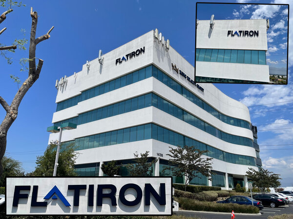
6. Integrated Indoor + Outdoor Branding
The brand experience shouldn’t reset at the entrance.
Integrated systems ensure monument signs, storefront letters, lobby displays, and interior graphics speak the same visual language. Consistency signals professionalism.
What quality looks like:
Material harmony across environments. Typography consistency. Accurate color reproduction on multiple substrates. Scaled applications that preserve recognition.
What poor execution looks like:
Different fonts indoors versus outdoors. Color mismatches. Premium exterior signage paired with budget interior elements.
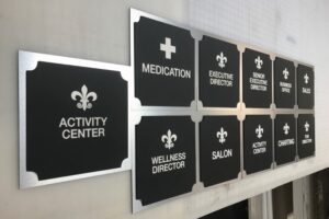
7. Wayfinding & Directional Signage for Large Properties
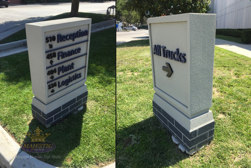
Clarity equals confidence.
Business parks, medical facilities, and commercial campuses across Southern California rely on directional signage to manage visitor flow. Effective wayfinding reduces frustration and enhances perceived organization.
What quality looks like:
Clear information hierarchy. Placement at true decision points. Legible typography at a distance. Seamless ADA integration.
What poor execution looks like:
Signs positioned too late. Overcrowded information. Design prioritizing aesthetics over readability. Inconsistent terminology.
8. Custom Typography & Unique
Stock fonts blend in. Custom letterforms differentiate.
Businesses investing in distinctive branding increasingly commission custom-fabricated typography. When done well, it creates unmistakable recognition.
What quality looks like:
Letterforms engineered for fabrication. Consistent stroke weight. Proper spacing adjusted for physical viewing. Long-distance legibility.
What poor execution looks like:
Overly intricate details that fail in fabrication. Spacing that works digitally but not physically. Reduced readability.
9. Modular & Scalable Sign Systems
Growth demands flexibility. Franchises and multi-location brands across Southern California benefit from modular systems that maintain consistency while adapting to site conditions.
What quality looks like:
Repeatable components. Standardized mounting systems. Documented material specifications. Brand consistency across properties.
What poor execution looks like:
Improvised adjustments at each site. Inconsistent fabrication. Brand drift between locations.
10. Signage Designed for Digital + Physical Branding Alignment

Your storefront should look like your website. Alignment between digital assets and physical signage strengthens recognition and trust. Customers encounter brands online first more often than ever.
What quality looks like:
Exact color matching. Consistent logo proportions. Typography that carries from screen to structure. Designed photo moments.
What poor execution looks like:
Altered logo proportions. Off-brand colors. Physical environments disconnected from digital identity.
Which Signage Trends Are Worth the Investment in 2026?
Trend selection should be strategic. Retail and hospitality brands benefit most from storefront visibility and LED illumination. Professional firms gain from dimensional letters and cohesive interior systems. Expanding brands see value in modular planning. When evaluating an investment, ask:
- Will this still look relevant in three years?
- Are materials specified for Southern California conditions?
- Does execution meet professional presentation standards?
Higher-quality materials cost more upfront, but they communicate more effectively and last longer. In competitive markets, presentation is not a minor detail. It’s leverage.
How Majestic Sign Studio Helps Southern California Businesses Stay Ahead
Trends identify direction. Execution delivers results.
Majestic Sign Studio works with businesses across Los Angeles, Orange County, San Diego, and the Inland Empire to translate emerging signage developments into durable, professionally fabricated systems.
Our team brings design insight, fabrication precision, and installation expertise informed by regional conditions. We understand local permitting processes, coastal material requirements, and the competitive landscape that defines Southern California commerce.
Whether upgrading a storefront or implementing a multi-location rollout, we focus on presentation standards that match the level your brand represents.
Final Thoughts: Planning Your 2026 Signage Investment
Trends don’t create results. Execution does.
In Southern California’s competitive market, your signage signals credibility before a customer ever walks in. Materials, fabrication standards, compliance, and installation precision determine whether your investment strengthens your brand or weakens it.
As you plan for 2026, align your signage with your long-term positioning and work with a partner who can execute at that level. Majestic Sign Studio helps Southern California businesses turn smart design direction into signage that performs.
Schedule a signage strategy consultation with us and make 2026 the year your brand stands out for the right reasons.
Frequently Asked Questions About Signage Trends
What are the top signage trends in Southern California for 2026?
Minimalist brand-focused design, LED illumination, dimensional lettering, sustainable materials, and cohesive indoor-outdoor branding are leading investments. Quality execution determines impact.
Are modern signage trends expensive?
Costs vary by material and complexity. Many current approaches, especially modular systems and energy-efficient lighting, provide long-term value through durability and efficiency.
Which signage trend lasts the longest?
Dimensional letters and LED-illuminated signage fabricated with high-quality materials typically offer the longest service life.
What signage works best in Southern California weather?
Aluminum, high-performance acrylics, corrosion-resistant finishes, and UV-stable vinyl perform best under regional conditions.
Do I need permits for new signage?
Yes. Most Southern California jurisdictions require permits for exterior signage. Professional guidance helps ensure compliance and avoid delays.