Whether it be for your exterior sign, banner, presentation, or website, readability is essential in design. Clear and decipherable images and text are a key factor in successfully reaching your audience, but how can you ensure you achieve it? Half has to do with layout and typography, but the other half derives from the color scheme you use.
Here are some tips on how to achieve the best color combinations for readability.
Determining Readability
To determine whether a color combination will offer good readability, you need to look into the color difference and brightness. This is especially imperative for web design, since it affects usability.
According to the World Wide Web Consortium (W3C), readability is determined by the difference in brightness and color. Both must be greater than a set range and can be derived from a formula. But, to make things easy, look for online text legibility tools, such as this Luminosity Colour Contrast Ratio Analyser, to see if your color combination passes the brightness difference test.
Light backgrounds
According to various studies, dark text on light backgrounds tends to be most readable. Go for this approach if you’re looking for a clear and crisp presentation, particularly for web design.
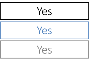
- White backgrounds: Simple and classic, black text on a white background provides the highest readability ratio. Blues and grays also provide the right contrast and thus work well on white backgrounds. However, avoid using white backgrounds for an entire webpage, which can strain the eyes. To ease the eyes, use colored backgrounds in blocks–for example, using a blue background with white boxes for text breaks up the design, provides the right level of contrast, and offers good readability. Avoid colors that are too light (like yellow), since they will not create enough contrast.
Check out this color combination table for the best colors to use on a white background.
- Gradient backgrounds: Using a gradient background that utilizes white and another light colors is a good way to add dimension to your design. A dark text color on top of a light gradient background allows for readability, while also being pleasing to the eye.
- Light backgrounds: Using a light color shade with black or dark text is a great way of adding subtle color. Try black text on light blue, pale green or gray background.
Check out this color combination table for the best colors to use on a white background.
- Gradient backgrounds: Using a gradient background that utilizes white and other light colors is a good way to add dimension to your design. A dark text color on top of a light gradient background allows for readability, while also being pleasing to the eye.
- Light backgrounds: Using a light color shade with black or dark text is a great way of adding subtle color. Try black text on light blue, pale green, or gray background.
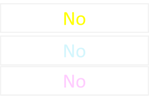
Dark Backgrounds with Light Text
Because this combination is known to cause strain on the eyes, be cautious with this approach. However, if you don’t have too much text to display, inverted backgrounds can work wonderfully. Try light text on dark backgrounds for print advertisements or headers. Remember that light text on dark backgrounds provide a high level of contrast—to ensure readability, decrease font-weight and increase leading and tracking so the letters are wider apart and have more space in between lines (learn more).
- Black backgrounds: High-chroma colors are best for black backgrounds because they offer a good contrast ratio without the eye fatigue (which occurs with white text on a black background). Yellow, green, cyan, and magenta are good colors to choose if you want to make text stand out, such as headings or important links on a webpage. Avoid red, purple, and blue on black.

Why Readability Matters in Color Design
Color choices affect how quickly and accurately people can process information. In signage, web design, and print, messages often need to be understood within seconds.
A sign on the side of a busy street has only a brief moment to capture attention, and poor color contrast can make it invisible to passersby. The same principle applies to websites and presentations; if the audience struggles to read the text, they may disengage entirely.
When colors are chosen for maximum clarity, they improve visibility, help direct focus to key elements, and make the overall design more effective. In marketing materials, this increases brand impact and retention. In functional signage, it ensures safety and accessibility. For both, strong readability is a practical necessity, not just a stylistic choice.
Understanding Readability: Contrast and Brightness
Two main factors determine whether a color combination is readable: brightness difference and color contrast ratio. The Web Content Accessibility Guidelines (WCAG) define minimum ratios for text and background colors to ensure accessibility. Large text requires a contrast ratio of at least 3:1, while normal body text should meet or exceed 4.5:1.
Online tools make it simple to test combinations before committing to them. The WebAIM Contrast Checker and Luminosity Colour Contrast Ratio Analyser are widely used resources. These tools calculate the exact ratio between text and background colors, helping designers align with accessibility and ADA signage standards.
Brightness difference refers to how light or dark each color appears. Two colors with similar brightness can blur together even if they’re different hues. That’s why yellow text on white, or dark blue text on black, fails the readability test. Checking both brightness and contrast ensures the design meets both aesthetic and functional goals.
Combinations to Avoid
- Colors that are too close together: Although it may seem natural to stick to similar colors, using colors that are too close together is something to avoid. You want to create some level of contrast, but not too much.

- Too many bright colors: For example, yellow on green or purple on green. You want to achieve attention with bright colors, but using several together will instead be too glaring to the eye. If you want to use yellow text, try a dark gray or dark blue background.

Need some assistance with your graphic design? Check out our graphic design tips, or contact us today for a graphic design consultation.
Readability in Signage: Practical Applications
Outdoor Signs
Outdoor signs must remain visible under changing light conditions. Sun glare can wash out pale colors, and shadows can reduce the visibility of darker tones. High-contrast pairings like black on white or white on navy work well for outdoor readability. Non-reflective finishes help reduce glare.
Interior Signs
Indoor signs often serve both functional and decorative purposes. Color choices should balance readability with the brand’s interior design palette. Soft background colors with bold text maintain clarity without overwhelming the space.
Digital Signs and LED Displays
These displays often feature motion, changing backgrounds, or varying brightness levels. To maintain readability:
- Use high-contrast color pairings.
- Keep text bold and avoid overly thin fonts.
- Limit background effects that compete with the text.
Across all types of signage, proper font weight, letter spacing, and line height are essential complements to color choice.
Make Readability Part of Brand Identity
Consistent color use reinforces brand recognition while keeping communication clear. If brand colors do not meet optimal readability standards, adjustments can be made for specific applications, such as using a slightly darker shade for backgrounds or pairing brand colors with high-contrast neutrals.
Majestic Sign Studio offers professional graphic design and sign consultation services to help businesses create visually appealing and readable designs. Contact us to schedule a consultation and ensure your branding communicates effectively across all media!
Frequently Asked Questions (FAQs)
- What is the best color combination for readability in signage?
Black text on a white background is considered the most readable. For signs, navy or dark gray on white is also highly effective. - How do I check if my design is accessible?
Use online tools like the WebAIM Contrast Checker or Luminosity Colour Contrast Ratio Analyser to verify contrast ratios meet WCAG guidelines. - Is white on black good for readability?
It works well for short text or headlines, but can cause eye strain for long paragraphs. For extended reading, dark text on a light background is preferable. - What colors should I avoid in signage?
Avoid low-contrast pairings such as yellow on white, navy on black, or pale gray on light blue, as well as clashing bright combinations like red on blue. - Does text color affect ADA compliance?
Yes. ADA signage standards require sufficient contrast between text and background to ensure accessibility for people with low vision. - Can bright colors be used effectively in signs?
Yes, but they should be paired with a dark, contrasting background to prevent glare and maintain legibility. - How do I match brand colors while staying readable?
Pair brand colors with neutral high-contrast tones for text or backgrounds. Adjust saturation and brightness as needed without losing brand recognition.