
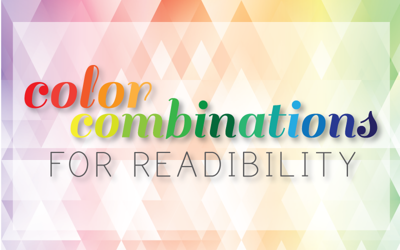
Whether it be for your exterior sign, banner, presentation or website, readability is essential in design. Clear and decipherable images and text are a key factor in successfully reaching your audience—but how can you ensure you achieve it? Half has to do with layout and typography, but the other half derives from the color scheme you use. Here are some tips on how to achieve the best color combinations for readability.
Determining Readability
To determine whether a color combination will offer good readability, you need to look into the color difference and brightness. This is especially imperative for web design, since it affects usability. According to The World Wide Web Consortium (W3C), readability is determined by the difference in brightness and color. Both must be greater than a set range and can be derived from a formula. But, to make things easy, look for online text legibility tools, such as this Luminosity Colour Contrast Ratio Analyser, to see if your color combination passes the brightness difference test.
Light backgrounds
According to various studies, dark text on light backgrounds tends to be most readable. Go for this approach if you’re looking for clear and crisp presentation, particularly for web design.
- White backgrounds: Simple and classic, black text on a white background provides the highest readability ratio. Blues and grays also provide the right contrast and thus work well on white backgrounds. However, avoid using white backgrounds for an entire webpage, which can strain the eyes. To ease the eyes, use colored backgrounds in blocks–for example, using a blue background with white boxes for text breaks up the design, provides the right level of contrast, and offers good readability. Avoid colors that are too light (like yellow), since they will not create enough contrast.


Check out this color combination table for the best colors to use on a white background.
- Gradient backgrounds: Using a gradient background that utilizes white and another light colors is a good way to add dimension to your design. A dark text color on top of a light gradient background allows for readability, while also being pleasing to the eye.
- Light backgrounds: Using a light color shade with black or dark text is a great way of adding subtle color. Try black text on light blue, pale green or gray background.
Dark Backgrounds with Light Text
Because this combination is known to cause strain on the eyes, be cautious with this approach. However, if you don’t have too much text to display, inverted backgrounds can work wonderfully. Try light text on dark backgrounds for print advertisements or headers. Remember that light text on dark backgrounds provide a high level of contrast—to ensure readability, decrease font-weight and increase leading and tracking so the letters are wider apart and have more space in between lines (learn more).
- Black backgrounds: High-chroma colors are best for black backgrounds because they offer a good contrast ratio without the eye fatigue (which occurs with white text on a black background). Yellow, green, cyan and magenta are good colors to choose if you want to make text stand out, such as headings or important links on a webpage. Avoid red, purple and blue on black.


Combinations to Avoid
- Colors that are too close together: Although it may seem first nature to stick to similar colors, using colors that are too close together is something to avoid. You want to create some level of contrast, but not too much.

- Too many bright colors: For example, yellow on green or purple on green. You want achieve attention with bright colors, but using several together will instead be too glaring to the eye. If you want to use yellow text, try a dark gray or dark blue background.

Need some assistance in your graphic design? Check out our graphic design tips, or contact us today for a graphic design consultation.